Apothecary: crafting an organic beauty identity - a graphic design showcase
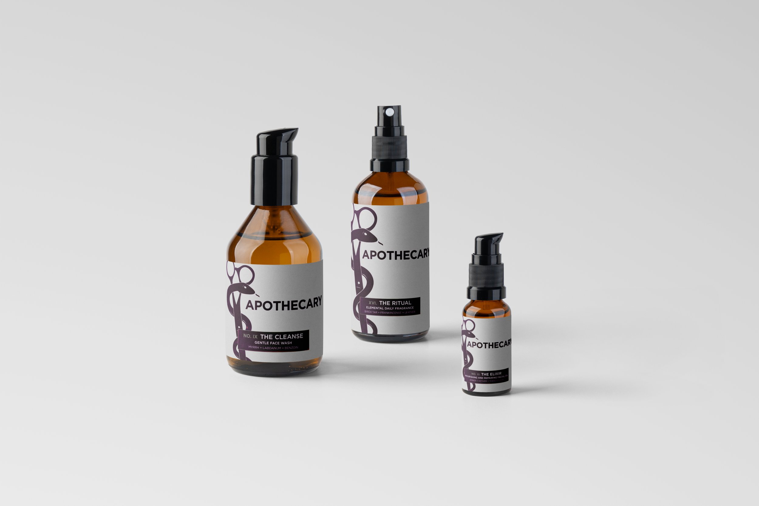
Apothecary is a bespoke personal care brand built on a numbered system and elemental aesthetic. With 19 SKU across hair and skin care, each product uses a thoughtful naming model (“No. 01…No. 19 / The _____”) to create a consistent, collectible identity. The design system fuses vintage apothecary references (serpent-&-scissors logo) with modern minimalism (matte finishes, clean typography) to offer a premium, design-forward experience. Notably: the finishing spray, No. 07 — The Lock, presents a matte-industrial can that communicates depth and quiet authority.
OVERVIEW
In an era where clean, traceable grooming rituals are surging, Apothecary sets itself apart by combining heritage inspiration with modern restraint. Drawing on the historical apothecary’s ritual of blending, sourcing, and healing, this brand translates that lineage into contemporary hair & skin care. The audience: design-sensitive individuals who value subtlety, craft, and sensory depth. With positioning rooted in “objects of care and quiet design,” Apothecary becomes not just a product line, but a curated ritual.
INSPIRATION
Brand Identity: Building the Alchemical Aesthetic
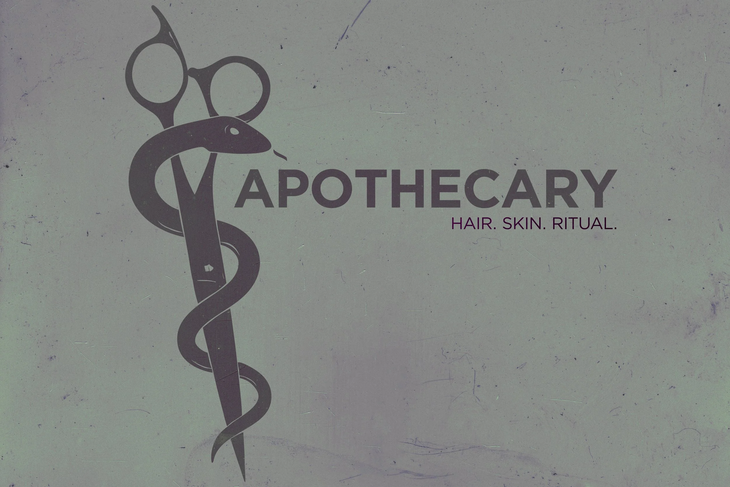
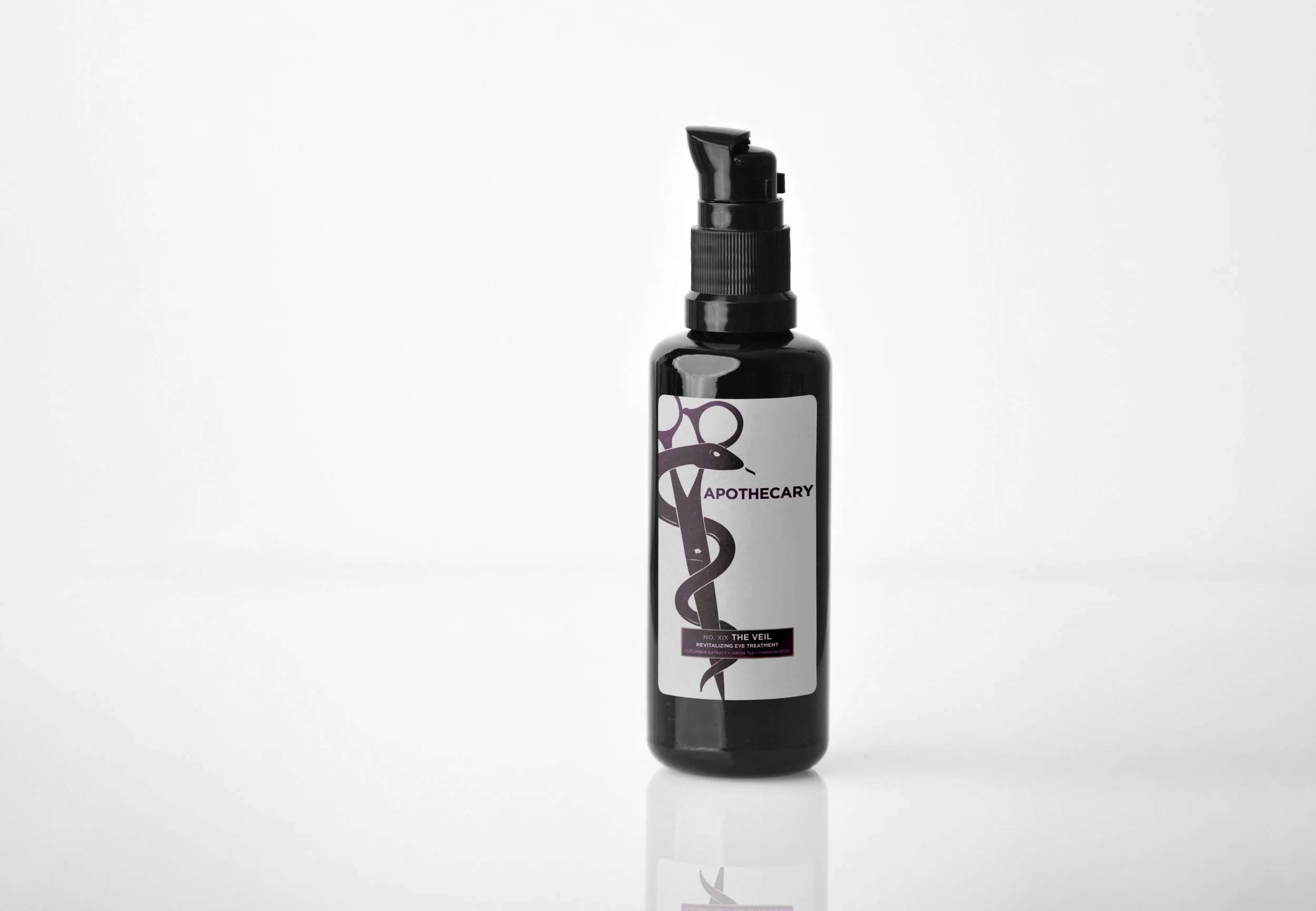
The heart of Apothecary is its tagline, "Hair. Skin. Ritual.," turning daily care into a ritual. The logomark combines a serpentine ribbon wrapped around a pair of cutting shears — a union of healing and craft, tradition and precision. The word-mark uses a clean modern typeface, reinforcing the minimal-ritual sensibility. Usage of tactile, matte finishes, subtle ink textures, and ghost-printed graphics adds material richness to otherwise minimal forms.
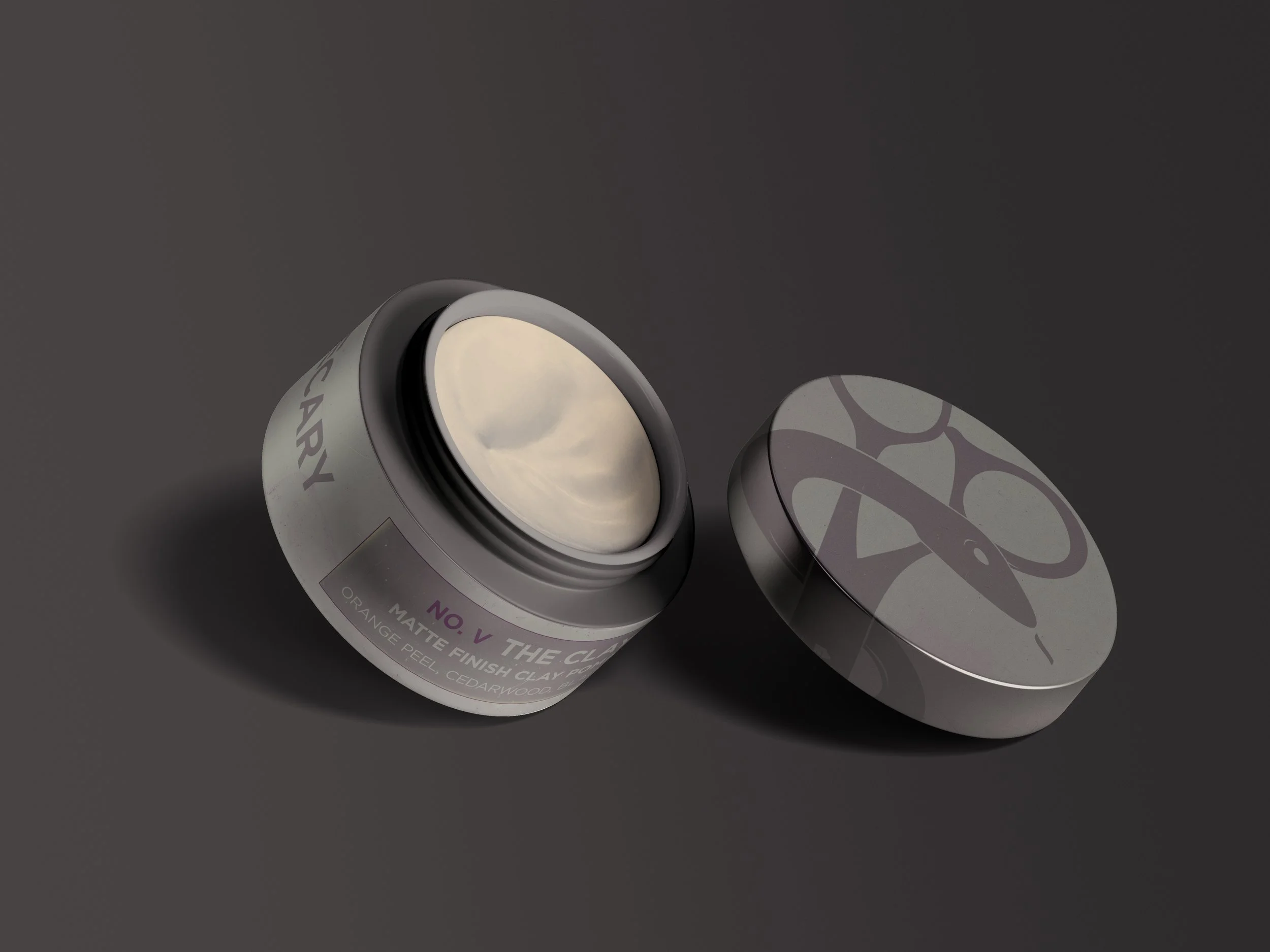
Color Palettes: Sage green with burgundy accents on hair products (e.g., pomade tin) exudes energy, while burgundy/off-white on skincare (e.g., amber bottles) soothe, tapping into organic color psychology.
color & Material:
Hair-care palette: Sage green (#A9B7A2 to #D8E2D3) as base, with burgundy accent (#330513) — evoking moss, stone, vitality.
Skin-care palette: Burgundy overlay on an off-white background (#D7D7D7) — evoking calm, clarity, and clinical heritage.
typography & hierarchy
The numbered system: NO. [Roman numeral] — THE [NAME] (e.g., NO. V — THE CLAY). Using uppercase Roman numerals gives visual authority; the “THE” format brings consistency across the line. Packaging legs lean heavily on whitespace, restrained type, and the cornerstone number to establish a collectible set.
PRODUCT ARCHITECTURE: TWO WORLDS, ONE SYSTEM
The collection includes 19 products across hair and skin. Each piece is unified by structure but varied in texture, scent, and function:
Hair line (Nos. 01–09) — products like The Wash, The Rinse, The Tonic, The Cream, The Clay, The Texture, The Hold, The Oil, The Root.
Skin line (Nos. 09–19) — products like The Cleanse, The Hydrator, The Elixir, The Body Wash, The Lotion, The Body Oil, The Salve, The Ritual, The Polish, The Balm, The Veil.
Every scent pairing — from orange peel + cedar moss to vetiver + tobacco leaf — was chosen to feel familiar but distinct, creating a sensory thread throughout the line.
Logo Integration: The Illustrator-crafted caduceus-scissors logo with Gotham text frames hair tins and skincare bottles with elegance, avoiding over-the-top trends and echoing In Fiore’s sophistication.
Visual Analysis
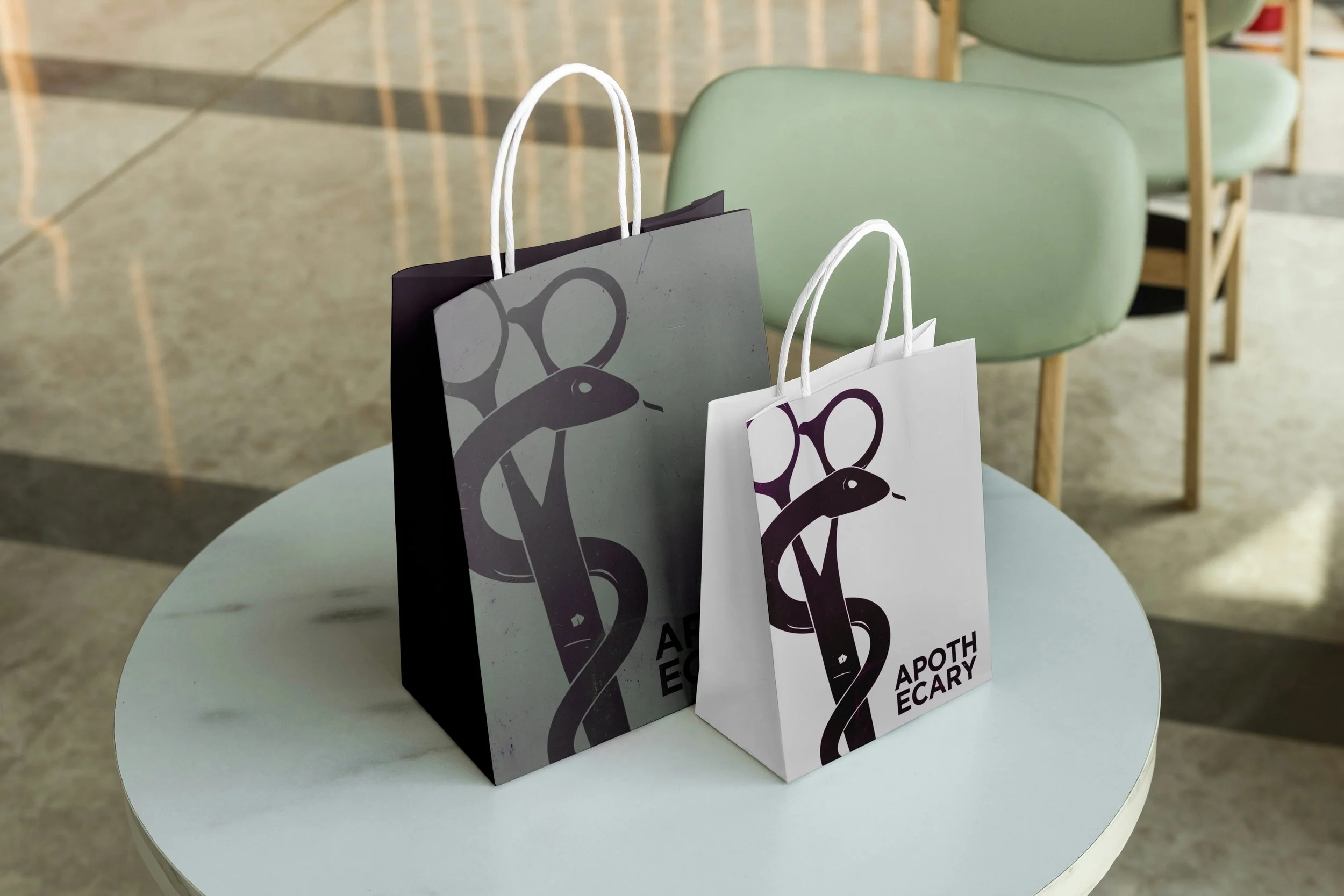
Compositional Variety: I played with flat lays (hair trio on pedestals), contextual shots (skincare on vanities), and lifestyle scenes (bags on tables), all with soft shadows for portfolio polish.
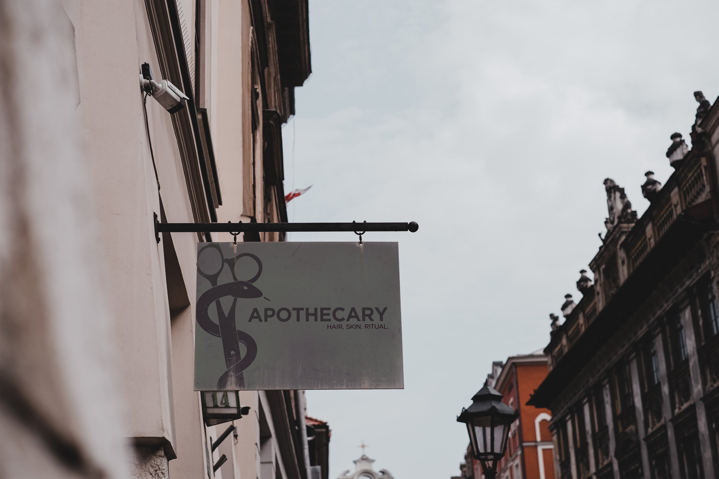
The Apothecary identity is built around a flexible logo system designed to stay strong across any format — from wide boxes to narrow bottles. The primary logo features the full snake-and-scissors illustration, paired with the “APOTHECARY” wordmark and optional tagline “HAIR. SKIN. RITUAL.” This full lockup is reserved for hero applications like mastheads, shipping boxes, and promotional assets.
On product packaging, a secondary cropped version takes over. In this version, the left handle of the scissors may be partially cropped, along with a subtle trim at the bottom, but the snake’s head and right handle always remain fully visible. This creates a strong, recognizable mark while giving the design room to breathe on smaller or narrower surfaces.
The amount of crop changes depending on the label format:
Wide labels: minimal cropping, more space around the wordmark.
Medium labels: moderate crop with the wordmark tucked beneath the snake’s eye.
Narrow labels: deeper crop (up to around 70%) with the wordmark nestled tight for maximum legibility.
The anchor point is always the snake’s head and eye, ensuring the mark remains instantly recognizable no matter how it’s applied. The wordmark can scale proportionally based on space, tightening up on narrower labels without sacrificing clarity. The tagline is intentionally left out of most packaging to keep the design clean and focused, appearing only in large-scale or hero placements.
Finally, clearspace and cropping rules keep everything consistent: the snake’s head and right handle are never cut off, right padding is maintained, and cropping is always deliberate — never accidental. This creates a logo system that’s both structured and flexible, giving the brand a distinct visual presence across every product.
LOGO SYSTEM & GUIDELINES
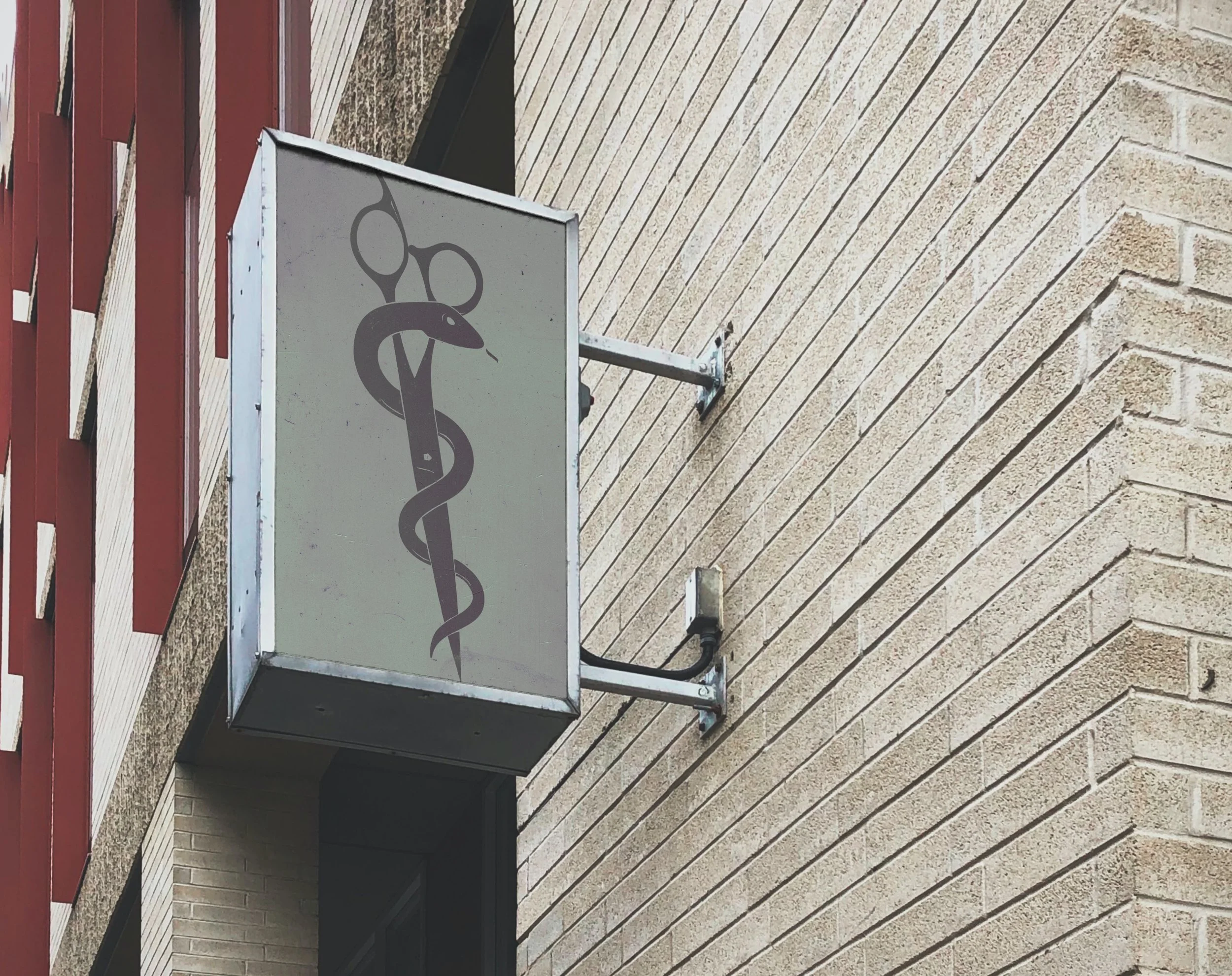
This logo system was also experimented with in various applications of store-front signage.
In addition to the primary and cropped lockups, a stacked version of the wordmark alone was created. This isn’t meant to replace the full snake-and-scissors logo — it’s used as a secondary accent on elements like bags and the side panels of product boxes.
The stacked wordmark allows the brand name to appear in tight vertical spaces where the hero mark isn’t practical, while still feeling intentional and consistent with the overall system. It’s a supporting element, not a substitute — reinforcing the brand’s presence without competing with the primary logo.
Marketing and Impact: Bringing the Design to Life
Apothecary occupies a niche crafted intersection: premium grooming meets modern ritual. Key positioning pillars:
Multiproduct coherence: a full system rather than isolated SKUs.
Design-first identity: the visual system supports brand story as much as product utility.
Sensory-rich ritual: scent, texture, and form matter as much as performance.
Promo ideas: segmenting hair vs. skin with dedicated palettes (e.g., #HairAlchemy in sage/burgundy, #SkinRitual in burgundy/off-white); pop-up experiences with physical shelving, scent layering stations; social stories capturing “number + ritual” sequences.
Hypothetical impact: strong repurchase intent, high visual trust, sustainability positioning (e.g., fully recyclable formats).
Apothecary is a study in balance — heritage and modernity, precision and texture, design and function. The numbered system keeps the brand disciplined, while the tangible materials give it soul. Together they form a world that feels timeless, collected, and human.
It’s less about creating another line of products — and more about creating a daily ritual that feels worth returning to.
Conclusion
LEXUS IS 350 - SPEC AD CONCEPT
CAMPAIGN LINE: “If it doesn’t fit, you don’t need it.”
The 2026 Lexus IS 350 is a luxury sports sedan built for driving enthusiasts. With its naturally aspirated V6, sharp handling, and refined craftsmanship, it delivers a performance-first experience. But compared to rivals like the BMW 3-Series or Audi A4, the IS 350 offers less trunk and rear-seat space — a drawback often highlighted by reviewers.
BACKGROUND:
Create a print ad in the bold, copy-driven style of 1980s–1990s automotive campaigns that:
Transforms limited cargo space from a flaw into a feature
Reinforces the IS 350’s purpose: a driver’s car, not a utility vehicle
Positions the IS 350 for consumers who value the experience of the drive above all else
OBJECTIVE:
Most sedans in this category sell themselves as “performance + practicality.” The IS 350 can’t compete on storage — so the campaign needed to flip this limitation into a defining brand statement.
CHALLENGE:
Reframe minimalism as strength. The IS 350 isn’t about carrying everything; it’s about carrying only what matters: the driver, the essentials, and the thrill of the road. By owning the limitation, Lexus signals confidence, focus, and aspiration.
STRATEGY:
Headline: “If it doesn’t fit, you don’t need it.”
Tone: Direct, unapologetic, and timeless — echoing classic car advertising.
Subcopy Themes:
“Life isn’t about carrying more. It’s about carrying what matters.”
“Some cars are built for storage. This one’s built for driving.”
Visual Direction:
Minimalist layouts with bold typography
Contrasts of clutter vs. clarity
Hero imagery of the IS 350 framed with negative space, reinforcing “less is more”
CREATIVE SOLUTION:
OUTCOME (HYPOTHETICAL FOR PORTFOLIO):
Reframed a product weakness as a lifestyle-driven strength
Differentiated the IS 350 in a crowded luxury sedan segment
Created an aspirational, confidence-driven message that resonates with those who drive for passion, not practicality
Disclaimer: Conceptual work created for portfolio purposes only. Not affiliated with Lexus.

Philadelphia Eagles–Themed Fundraiser T-Shirt Logo
client: Families behind the badge children’s foundation/philadelphia highway patrol
role: Logo & Apparel Design
project overview:
The client approached me to create a custom t-shirt design for a fundraiser event. The goal was to energize supporters by blending the organization’s existing logo with a Philadelphia Eagles–inspired theme, tapping into the strong sense of pride and identity tied to the team.
challenge:
The design needed to:
Incorporate the organization’s shield logo without losing brand recognition.
Capture the bold, fierce energy associated with the Eagles.
Work effectively as a t-shirt graphic (scalable, legible, and screen-print–ready).
approach:
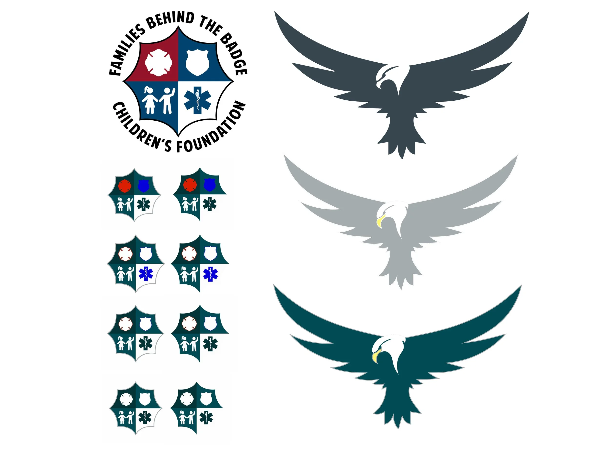
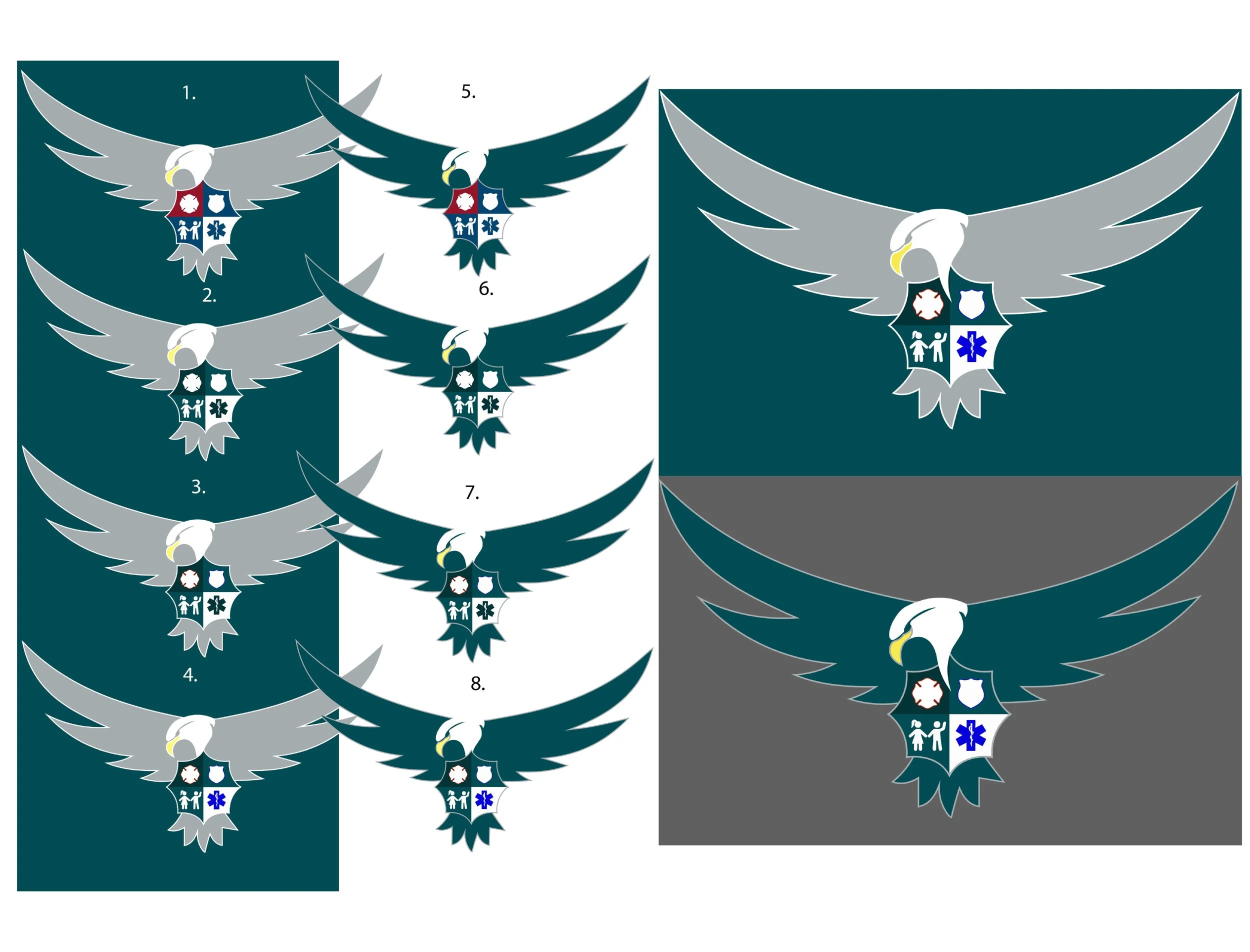
I began with the client’s existing shield logo as the foundation. To build the Eagles-inspired identity, I sourced and customized a vector illustration of an eagle (SVG). The first concern of the client was that the sourced SVG looked too much like a pigeon, so I edited the paths and extended the beak to give it more of an eagle look. Once the eagle design was approved, I explored a variety of potential colors that matched the color palette of the Eagles.
I carefully merged the two elements to form a cohesive mark that felt both loyal to the organization and unmistakably Philadelphia Eagles.
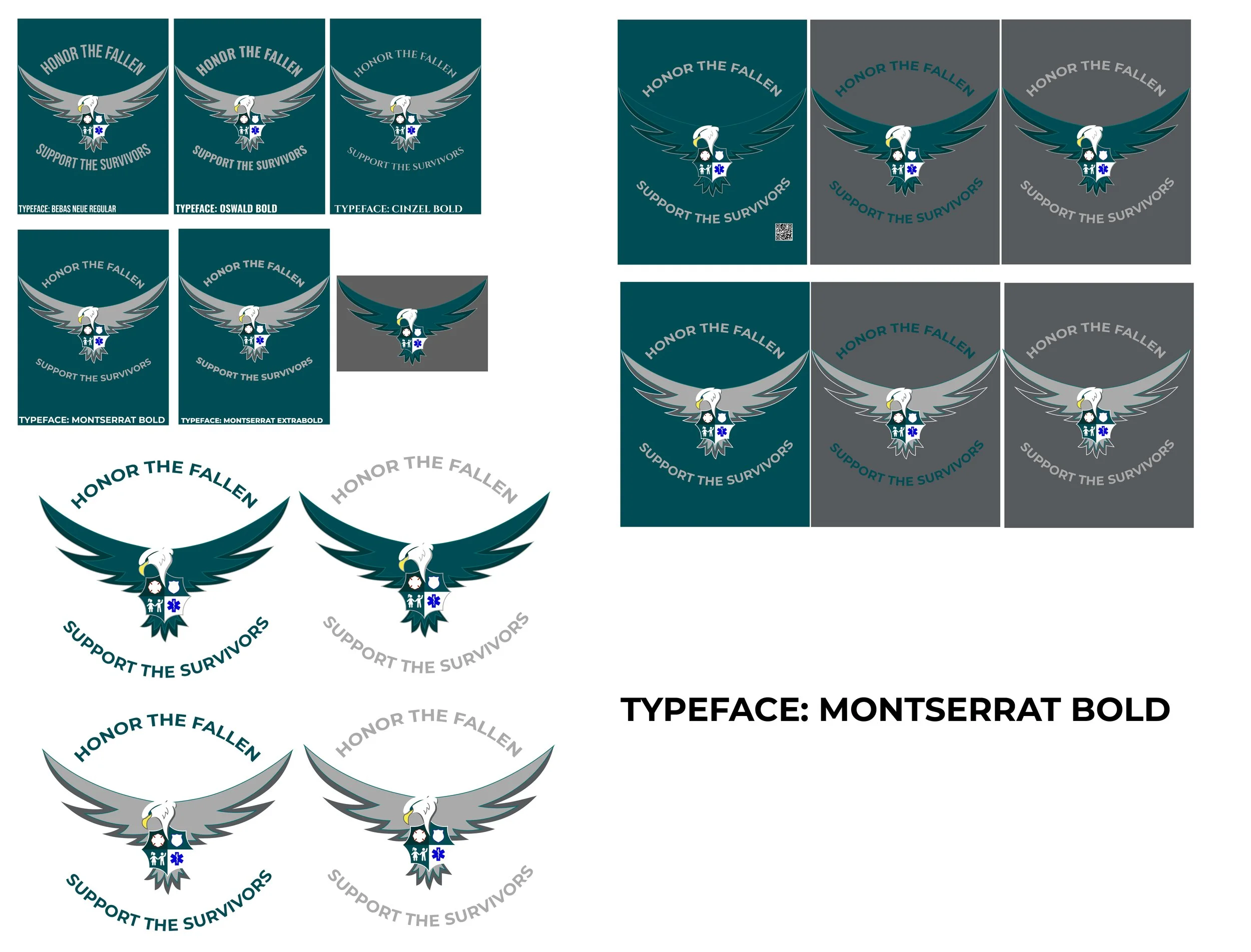
Color and typeface were both critical factors. While exploring palettes echoing the Eagles’ greens, blacks and silvers, I had to ensure harmony with the client’s existing colors. Attention was given to balancing contrast and print limitations, keeping the design bold but practical for apparel. The design went through several iterations before finally landing on something that was approved by both the client and myself.
outcome:
The final logo seamlessly unites the organization’s established brand with Philadelphia Eagles iconography. The client signed off on the design, and the t-shirts provided a powerful visual anchor for the fundraiser, reinforcing community spirit while keeping the organization’s identity front and center.
Deliverables:
Final merged logo (vector formats: SVG, AI, PDF)
Color and monochrome variations
T-shirt mockups for presentation


